Elle Cordova became an internet sensation talking about, of all things, typefaces. She managed, in a few minutes, to convey what often took months of graphic design teaching to get across to my students.
Typefaces convey a feeling. They have a character. A personality, even.
Elle Cordova's “Fonts hanging out” comedy sketch trilogy (4 min)
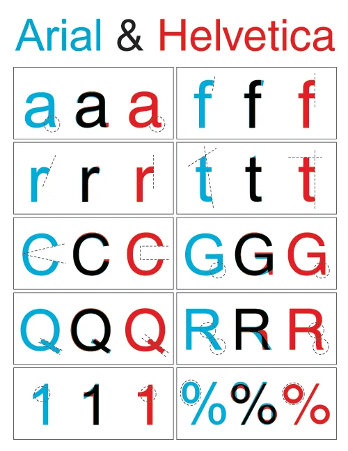
It makes a massive difference to a message’s reception whether you write it in Comic Sans or Arial. So much is obvious. But sometimes the differences between typefaces are extremely subtle. Try distinguishing Arial from Helvetica, for example.
Arial is generally regarded as a knock-off of Helvetica, which means you will have to look hard, but if you are a ‘spot the difference’ aficionado, the differences are plainly there.
Cordova portrays Arial as fan-girling Helvetica – the ultimate cool typeface. In the portrayal, and as a typeface, Helvetica comes across as understated but totally complete. If you want to make sure something looks authoritative (like the packaging of a medicine, for example) you set it in Helvetica.
I always had a problem with Helvetica. It’s so darn sure of itself.
Helvetica is what you would set the Ten Commandments in if you could wrest them away from Trajan and Times New Roman.
It also accomplishes what graphic design aspires to. It oozes certainty. In some ways I’m actually envious of that certainty. Looking at a piece of graphic design I would see work finished and comfortable in its own completeness. My own calligraphy never was. It had life, but not certainty.
Looking at a piece of graphic design I would see work finished and comfortable in its own completeness.
My own calligraphy never was. It had life, but not certainty.
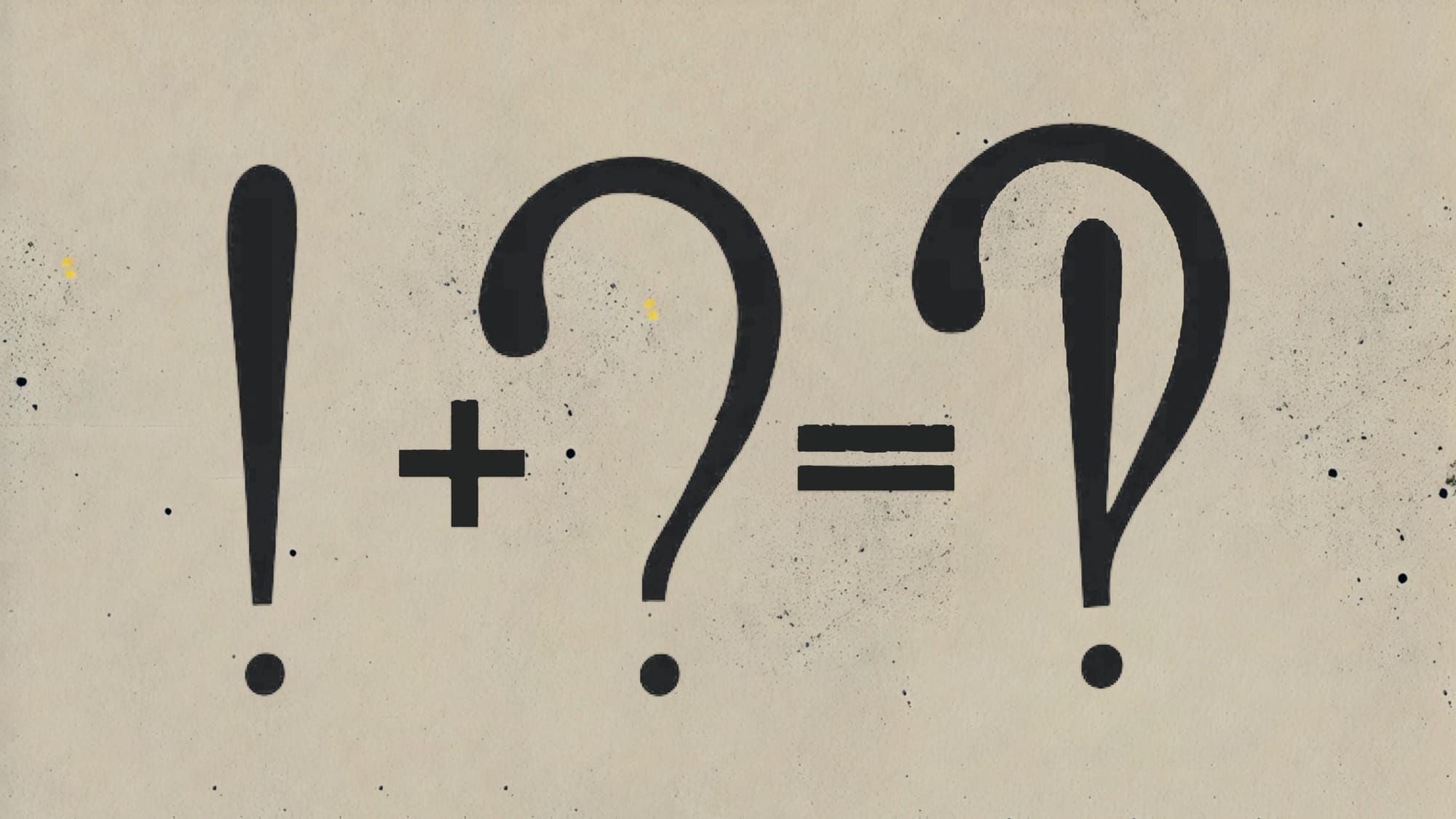
I eventually realised that if Helvetica (and graphic design) aspires to be an exclamation mark, my own work is defined by a question mark. Basically, it is research, never completed design.
The same applies to my other research areas. I love the process of questioning, and very much dislike having to come up with a finished product. The only way I finished my PhD was by following the advice of a colleague who said that you had to imagine killing off your topic in order to complete it: put it in a coffin and use silver shears to lop off any limbs that threatened to climb out again.
Fundamentally, all research begets more research, so ‘finishing’ anything should always be accompanied by inverted commas. It’s actually just you taking a breather while the corpse grows legs and walks off in another direction.
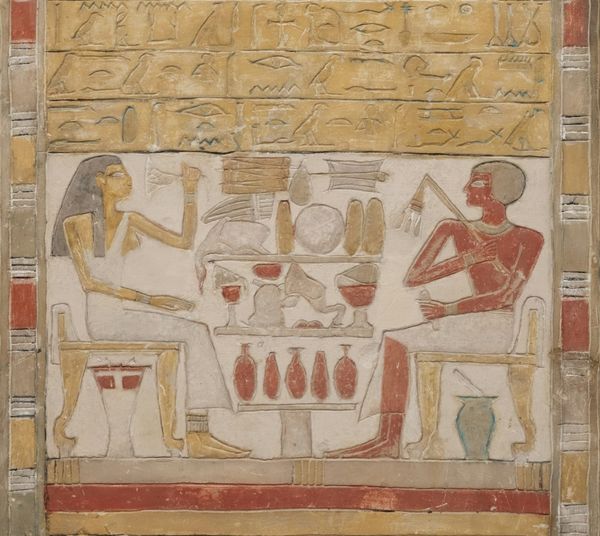
We are told that the Ten Commandments were written on a stone tablet. Like Helvetica, their job was to be solid, certain and immutable. Yet most tablets in the ancient world were half-hollowed out wooden boards filled with wax. People might write laws on them, but as long as they stayed on wax, they could be easily flattened out and rewritten.
Wax tablets were always in a process of becoming. They would briefly take a finished form, but then be rubbed out and reused.
If stone tablets were exclamation marks, wax tablets allowed for change. But they were not necessarily question marks either.
Enter the interrobang. Proposed in 1962, it is a punctuation mark that combines both the question mark and an exclamation mark. It was intended for use in headlines where people had previously used both – as in ‘He said what?!’

Conceptually, however, I think the interrobang is a useful tool, because it allows us to conceive an end point that is simultaneously an exclamation mark and a question mark.
An interrobang is a much better representation of the finishing point of a piece of research. We share it not as the final word, or the complete package. We share it as a signpost. Something that vaguely points us towards something else.
An interrobang is a much better representation of the finishing point of a piece of research.
We share it not as the final word, or the complete package. We share it as a signpost. Something that vaguely points us towards something else.
Ultimately, this is the closest I can come to visualising what I am doing in this series. I don’t want it to be an exclamation mark, but I can’t only share questions. Some line must be written in the sand, but it shouldn’t just sit there, virtue-signaling smugly in Helvetica.
My own favourite typeface is Monotype Garamond – a slightly different version to Cordova’s character.
This is Monotype Garamond.
At first sight it is complete, but the more you explore it, the quirkier and more inconsistent its elements appear to be. And it has life, and energy. It is a typeface that will move you along in your journey in an unfussy way, not force you to stand and admire it.
And that, I think, is what wisdom should be doing.
It’s not the Ten Commandments set in stone. It’s not a destination. It’s a pseudo-signpost to help you on your way.
And you never know. It might even surprise you and turn out to be written in Comic Sans.
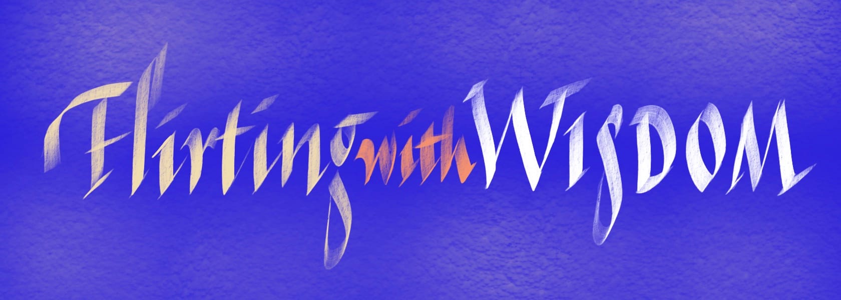
Each vignette invites readers to embrace the beauty of unfinished thinking and the art of holding life’s ongoing questions.







Member discussion